
UI/UX design decides what a person sees, in which order, and what happens when they tap or click, before production code locks those choices in. A clear interface cuts support questions, helps people finish a purchase or a booking, and makes the next feature cheaper to build because the structure already exists.
Contents
At CodeWiz, UI/UX design sits next to development. We research how people use a product, draw wireframes, build clickable Figma prototypes and turn the approved screens into a system of components our own engineers can implement.
This service is for companies launching a website, shop or app, teams redesigning a product that looks dated or loses people halfway through a task, and founders who need a prototype they can put in front of customers before committing to a full build. If you already have screens and need them turned into something developers can extend, we start from there.
For ux design, open-source tools are the default when they fit the job.
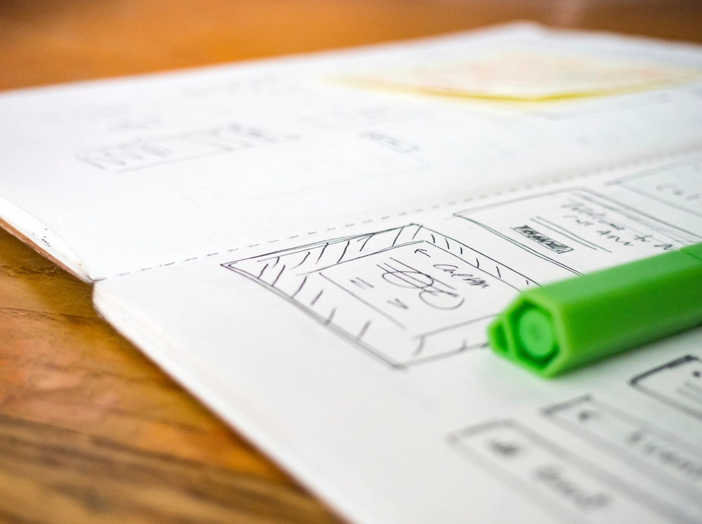
User Research and Wireframes
User research is a short look at who the product is for, what they are trying to finish, and where the current site gets in the way. For a marketing site that may be a few stakeholder interviews and a read of analytics. For a live product it includes drop-off, on-site search and the screens that generate support tickets.
A ux design engagement starts from the system you already run.
What we actually look at
- Stakeholder interviews: goals, constraints, who must approve the work and what “done” means in business terms, not in shades of blue.
- Analytics and search: landing pages, exit pages, on-site search queries and devices. If the numbers exist, we use them before inventing a new homepage.
- Support and sales notes: the questions people already ask are a map of missing content and broken labels.
- A walk through the current product: we complete the main tasks ourselves and write down every dead end.
- A short usability pass: once a wireframe or prototype exists, a few people who resemble your customers try one task. The obvious blockers usually show up quickly. We do not pretend a tiny sample is a statistical study.
Wireframes before colour
A wireframe is a low-fidelity layout: what is on the screen, what is primary, and how someone moves to the next step. Colour, photography and brand styling wait. That order matters, because a polished screen hides structural problems. Stakeholders approve the flow while changes are still cheap, and developers can see content hierarchy instead of guessing it from a hero image.
The ux design work stays in your repository and on your infrastructure.
Deliverables are a sitemap, the main flows (arrival to sign-up, search to checkout, request to confirmation) and annotated wireframes for the templates that repeat: home, listing, detail, form, account, empty and error. Notes cover what each control does, what appears while the system waits, and what a failed request looks like.
CodeWiz reviews ux design in production, not only in a demo.
Figma Prototypes You Can Try Before Development
Figma is where the wireframes become a realistic interface and a prototype people can click. We work in one file the whole team can comment on, with components rather than disconnected frames, so a change to a button or a form field updates every screen that uses it.
Decisions about ux design follow the business constraint that actually hurts.
What the prototype covers
- The primary flows, linked with realistic transitions, so a reviewer can complete a task instead of flipping through a slide deck.
- Components and variants for default, hover, focus, disabled, error and loading states. Missing states are where most “simple” screens become expensive in code.
- Auto layout so the same frame can be checked at phone width and desktop width, not only at the size it was drawn.
- Variables for colour, type and spacing, which later map to CSS custom properties or the theme of the stack we build in.
- A build you can open on your own phone. Approving a desktop mock and discovering the form does not fit a thumb is a late and costly surprise.
Comments stay in the file. When the flows are stable, developers read spacing, type and assets from Figma’s Dev Mode instead of measuring screenshots.
These are the artefacts a typical UI/UX design engagement produces, and who uses each one:
| Deliverable | Question it answers | Form | Who uses it |
|---|---|---|---|
| Research notes | Who is this for, and where do they get stuck? | Short written findings, not a slide novel | You and the design team |
| Flows and sitemap | What is the path from arrival to the goal? | Diagram of steps and decisions | Stakeholders and developers |
| Wireframes | What is on each screen, and in what order? | Low-fidelity layouts with notes | Everyone, before visual design |
| Figma prototype | Can a person complete the task? | Clickable screens, including errors | You, test participants, developers |
| Visual design | What does the finished interface look like? | High-fidelity screens and states | Developers and content editors |
| Design system | Can the next screen be built without reinventing? | Tokens, components, usage notes | Designers and developers |

Design Systems and Component Libraries
A design system is the set of decisions you stop remaking: colours, type, spacing, radii and the components built from them. A component library is that system in Figma and, when we also build, in code. Without it, every new page invents a slightly different button.
Tokens first, then components
We start with tokens, named values that design and code share. A button uses a primary colour token, a spacing token and a radius token. When the brand shifts, the change is one value, not a hunt through forty frames.
:root {
  --color-bg: #f7f6f3;
  --color-text: #1c1917;
  --color-primary: #0f6b4c;
  --color-danger: #9f1239;
  --space-2: 0.5rem;
  --space-4: 1rem;
  --radius-md: 0.5rem;
  --font-sans: "Source Sans 3", system-ui, sans-serif;
}
On top of the tokens we design the components that repeat: buttons, links, inputs, selects, checkboxes, alerts, cards, navigation, tables, pagination, empty states and dialogs. Each one documents when to use it. A second button style needs a reason. A single campaign page can stay a small set of shared styles. A shop or an application that will grow needs the documented system, with the same names in Figma and in code.
Responsive Web Design
Responsive web design means the layout changes with the viewport, the input and the content, instead of a desktop picture scaled until it breaks. We design the phone, the desktop and the wide desktop, because a layout that only works at one width is not finished.
Reflow, not shrink
- Navigation that is usable with a thumb and still makes sense with a mouse: a clear menu, a visible current page, and no hover-only actions.
- Type that stays readable without pinching, a limited type scale, and line lengths that do not stretch across an ultrawide monitor.
- Touch targets and contrast checked against WCAG 2.2: at least 4.5:1 for normal text, and primary controls comfortably larger than the 24 by 24 pixel minimum.
- Images with real crops for narrow screens, not a hero that shoves the headline below the fold. Heavy images also fight the Largest Contentful Paint target Google recommends, under 2.5 seconds, which is why design and performance are one conversation. We have written about how we approach PageSpeed and Core Web Vitals.
- Tables, filters and long forms given a layout that works on a phone: stacked rows, sticky actions, or a deliberate simplification, never a horizontal scrollbar as the plan.
We check the frames at the widths your analytics actually show, then again in a browser. Figma is not a rendering engine. Fluid type, wrapping and scroll behaviour get confirmed in code.
Conversion-Focused Landing Pages
A landing page has one job. Everything on it either helps that job or competes with it. We design campaign pages, service pages and product pages around a single primary action: request a quote, start a trial, book a call, add to cart, or finish a checkout step.
- The offer is understandable without scrolling on a phone: what it is, who it is for, and what to do next.
- Proof sits next to the claim. That means facts you can stand behind, such as a concrete specification, a price, a delivery time or a logo you have permission to show. We do not invent testimonials or statistics to fill a gap.
- Forms ask for what the next step needs, not for a full CRM record. Every extra field is a reason to leave.
- Secondary paths (details, FAQ, comparison) exist, but they do not outrank the primary button.
- The page stays fast. A carefully typeset page that loads a megabyte of unused font files still loses people.
For shops, the same thinking applies to category, product and cart pages: a clear price, availability, shipping and a path that does not reset. We have described that layer in our piece on turning WooCommerce, Shopify, PrestaShop and Magento into shops that convert. A test only makes sense once there is enough traffic to read a result. Below that, we remove obvious friction instead of running an empty experiment.
Design Handoff That Developers Can Build
Most design fails in the gap between the file and the repository. We close that gap by naming components the way code will name them, exporting only the assets that are actually needed, and writing the states that are easy to forget: empty, loading, validation, permission denied, offline, and the long word in a button that wraps onto two lines.
Content is real where you can provide it. Placeholder text hides a longer headline, and a product title that is a full sentence. We also note focus order and labels for icon-only buttons, so accessibility is not a list discovered after launch.
Because CodeWiz designs and builds, handoff is often internal: the people who drew the system implement it in WordPress, Laravel or React. When you already have developers, we hand over the Figma library, the token list and a short guide, and we stay available while the first templates are built.
Common UI/UX Design Mistakes
- Designing only the desktop happy path, then discovering the phone layout and the error states during development.
- Using placeholder text that is shorter than the real content, so nothing fits once the copy arrives.
- Too many type sizes, greys and button styles, with no rule for which one is primary.
- Hiding the main action under a tall hero, a carousel or an autoplaying video.
- No focus styles, so keyboard users cannot see where they are.
What Drives the Cost of UI/UX Design
We estimate after a short look at the product, not from a page count alone. The factors that move the effort are consistent:
- How many unique templates and flows there are, and how many states each one needs.
- Whether research starts from nothing or from analytics, recordings and a live site.
- A new visual language versus an extension of a brand you already have.
- Pages only, or a design system that other people will keep using.
- Languages. Longer strings, right-to-left scripts and separate layouts add real work.
- Design only, or design plus implementation, and how many rounds of review are in the plan.
A focused brochure or a single landing page is a small project. A multi-role application with a design system is not. We say which one you are buying before work starts, in the same spirit as our approach to premium development without premium prices.
How We Work
- Discovery: we agree the audience, the primary tasks, the business goal and what already exists: brand, site, analytics, content.
- Flows: we map the paths that matter and cut the ones that do not earn a place in the first release.
- Wireframes: structure and content hierarchy, reviewed before any visual polish.
- Interface and prototype: visual design in Figma, components and a clickable prototype you can try on a phone.
- Revise: we test the main task, resolve comments and lock the states developers need.
- Handoff or build: tokens, components and specs go to implementation, which we can do ourselves, followed by support as new screens are added.
Why CodeWiz
- Design and engineering together: we design interfaces we are prepared to build, in WordPress, Laravel, React and the rest of a full-stack practice.
- Technology in service of the task: the interface exists to complete a business goal, not to demonstrate a trend.
- Tailored scope: a landing page gets a landing page. A growing product gets a system. We will not sell you the larger one by default.
- Open tools where they help: Figma for design, and an open-source stack underneath when we build, so you are not locked to a proprietary front end.
- Fair pricing: premium work without premium prices, from Banja Luka, working remotely with clients locally and internationally. More about CodeWiz.
Frequently Asked Questions
How much does UI/UX design cost?
It depends on the number of flows, how much research is needed, whether you want a design system, and whether we also build the front end. A single landing page and a multi-screen product are different projects. You get a written estimate after discovery, before design starts.
How long does a UI/UX design project take?
A small site or landing page is often a couple of weeks from discovery to an approved prototype. A product with several roles, a design system and usability checks takes longer and is usually split into a first release and a follow-up. We agree who signs off, and how quickly, because review time is part of the schedule.
Do you only design, or do you build as well?
Both. Some clients need the Figma library and a clean handoff to their own developers. Others want us to design and implement the site or app. Design only is a normal engagement when a team is already waiting to build.
Do we need user research for a small website?
You need a clear picture of the visitor and the task. For a small site that can be a few conversations and a look at the current pages. A deeper pass pays off when people already fail at something you can measure, such as checkout, sign-up or finding a service. We will say so if a heavier study would not change the design.
Can you redesign a site without rebuilding it?
Often, yes. We can reskin templates, simplify navigation and rebuild the key landing templates while leaving a working backend in place. When the content structure is the problem, a visual refresh will not fix it, and we will say so.
What do you need from us to start?
Who the site or app is for, the one or two actions that matter, any existing brand material, and access to analytics if a site is already live. Draft copy helps. If the copy does not exist yet, we design with realistic stand-in text and leave room for the real sentences.
Ready to Clarify the Interface?
Tell us what people should be able to finish on the site or in the app, and we will propose the research, the prototype and whether a design system belongs in the first round. Contact us to talk it through, or see the rest of our development services.